Module 5 • Lesson 2🔴 Spot Color, Duotone & Halftone
A press can't lay down a smooth gray — it prints tiny dots that your eye blends into tone. Understanding that halftone reality, plus how to reach beyond CMYK with spot inks and stretch a grayscale with a duotone, is what makes print work look intentional instead of accidental.
📚 What You'll Learn
By the end of this lesson, you will be able to:
- Explain halftone screening: dots, LPI/screen ruling, angles, and dot gain
- Use spot colors (Pantone) for gamut, brand, metallic, and fluorescent inks
- Build a duotone to get richer tonal range from one grayscale
- Add a spot channel for a varnish, foil, or specific ink
- Choose process vs spot for a given print job
⏱️ Estimated Time: 55 minutes
🎯 Project: A duotone and a spot-channel treatment, with a clear grasp of the halftone that prints them.
In This Lesson
👤 The Goal: Tone from Dots
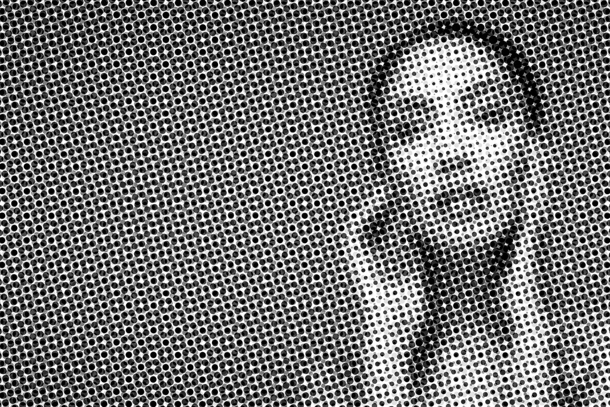
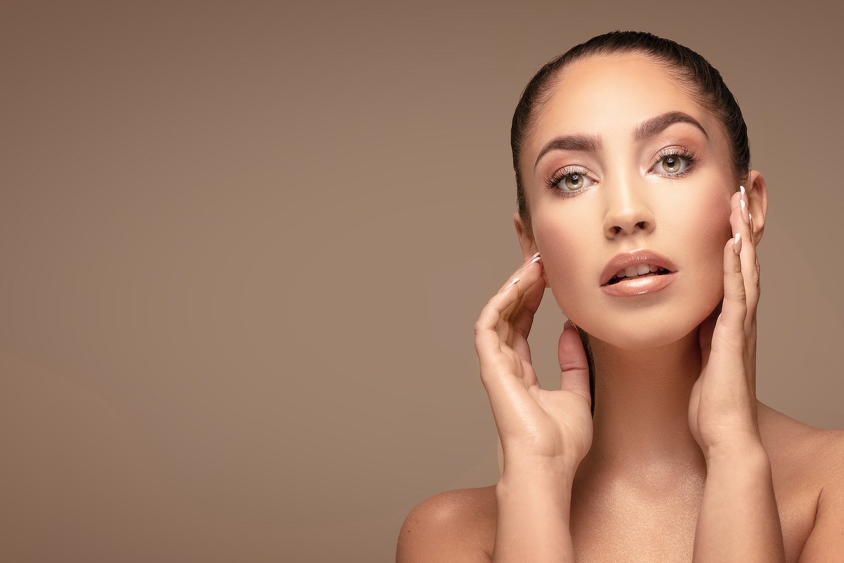
The same portrait, two realities. On the right, the continuous-tone image as you see it on screen. On the left, the same image as a halftone — the pattern of dots a press actually prints, growing and shrinking to fake every shade of gray. Every printed photo you've ever held is the left side, up close. Drag the handle:
🧠 Mental Model: The Press Only Has Dots
Ink is either on the paper or it isn't — there's no "40% gray" ink. A press fakes continuous tone with a halftone screen: a grid of dots that grow toward the shadows and shrink toward the highlights, which your eye blends at normal viewing distance. The screen's fineness is its ruling (lines per inch — ~85 LPI newsprint, ~150 magazine, ~200+ fine art). Each process ink prints at a different screen angle so the dots form clean rosettes instead of clashing moiré.
One more press fact: dot gain. Ink spreads as it soaks into paper, so a 50% dot prints heavier than 50% — more on absorbent stock. The press profile compensates, which is another reason you convert with the right profile (Lesson 5.1) rather than eyeball it.
🎨 Duotone & Spot Channels
A duotone prints a grayscale with two (or three/four — tri/quad) inks instead of one, so the tonal range is far richer than a single black could give: often a black for depth plus a warm or cool ink for the midtones. Image ▸ Mode ▸ Duotone lets you set each ink and shape its curve; it's only available for an 8-bit Grayscale image, so convert to Grayscale and to 8 Bits/Channel first. A spot channel (Channels panel ▸ New Spot Channel) adds a dedicated ink — a Pantone, a metallic, or a varnish — that prints on its own plate, outside CMYK entirely.
⚠️ Spot inks need their own plate and cost money
Every spot ink is a separate plate and a separate run on press, so a "5-color" job (CMYK + 1 spot) costs more than 4-color. Use spots deliberately — a brand color that must be exact, a metallic or fluorescent CMYK can't reach, a varnish — not decoratively. The printer needs to know exactly how many plates you're sending.
🎯 Spot Color vs Process
Process (CMYK) reproduces full-color photographs from four inks — it's how any photographic print works. Spot color prints a specific pre-mixed ink and is the right call when a color must be exact and consistent (a brand's blue on every run), outside CMYK gamut (a vivid orange, a metallic gold, a fluorescent), or a special finish (a spot UV varnish that's clear ink). Many jobs mix them: CMYK photography plus one spot for the logo.
✅ Halftone is why resolution rules exist
The old "300 ppi for print" guideline comes straight from halftone: you want an image resolution roughly twice the screen ruling (≈2 × 150 LPI = 300 ppi). Understand the screen and the resolution rules stop being magic numbers and become something you can reason about for any ruling and viewing distance.
🛠️ Guided Build: Duotone & Spot
Open a strong grayscale image (convert a portrait: Image ▸ Mode ▸ Grayscale, then Image ▸ Mode ▸ 8 Bits/Channel, because Duotone mode is 8-bit only).
Step 1: Build a duotone · 12 min
- Image ▸ Mode ▸ Duotone. Ink 1 Black; Ink 2 a warm Pantone. Shape each curve so black holds the shadows and the spot fills the midtones.
Step 2: Add a spot channel · 10 min
- On a CMYK piece, Channels panel menu ▸ New Spot Channel. Click the color swatch, then Color Libraries, and pick a Pantone (depending on your version and license, some Pantone books may require a Pantone Connect subscription). For a varnish, set Solidity to 0% so it previews as clear.
- With the spot channel selected, paint where the ink should print, such as a logo or a gloss highlight. In a spot channel, black = 100% ink, grays are tints, and white means no ink.
Step 3: Reason about the screen · 8 min
- Decide a screen ruling for your stock (newsprint ~85, magazine ~150). Confirm your image resolution is ~2× the LPI. Note the intended dot gain compensation is in the profile.
Step 4: Prepare for output · 6 min
- Save the spot-channel piece in a format that preserves spot channels: PSD, TIFF, or Photoshop PDF (check Spot Colors in the Save As dialog). DCS 2.0 is a legacy option that may be missing or hidden in current versions, so ask the printer before relying on it. Save the duotone as PSD, EPS, or Photoshop PDF, since TIFF doesn't support Duotone mode. Confirm the plate count you're sending the printer. 🏆
✅ Project Completion Checklist
- ☐ A duotone with two inks and shaped tone curves
- ☐ A spot channel added and painted where the ink prints
- ☐ Resolution reasoned from the screen ruling (~2× LPI)
- ☐ Saved in a spot-preserving format
- ☐ Plate count confirmed for the printer
🧗 Now You: Solo Variation
🌟 Your challenge
- Build the same grayscale as a warm duotone and a cool duotone, and as a tritone, and compare the tonal richness.
- Design a two-color poster (black + one Pantone) that couldn't be improved by full CMYK — constraint as a style.
- Zoom into a printed magazine photo with a loupe (or your phone macro) and find the rosette. Seeing real halftone dots makes the concept permanent.
Going further: mock up a spot-gloss varnish as its own channel over a matte image and preview where the shine would catch — a premium packaging trick.
🍳 Recipe Card: Spot & Screen
Beyond four inks
- Tone is halftone dots: ruling (LPI), angle, dot gain
- Image resolution ≈ 2× the LPI
- Duotone (8-bit Grayscale first): 2+ inks with tone curves for richer range
- Spot channel: Pantone / metallic / varnish on its own plate
- Spot when color must be exact, out-of-gamut, or a finish; save spot-preserving format
Mantra: the press has dots and named inks — design for both.
📓 Learning Journal
Add to your journal after this lesson:
- Key concepts you learned
- Techniques that clicked for you
- Questions or confusion points to revisit
- Ideas you want to try
- Your progress and feelings about learning this
✍️ This lesson's prompt: When would you spend a client's money on a spot color instead of CMYK? Write the specific justification — that reasoning is what a print buyer is paying you for.
📝 Lesson Summary
🎓 Key Takeaways
- The press only prints dots: dot size makes tone, ruling (LPI) sets fineness, and screen angles prevent moiré.
- Dot gain makes dots print heavier than their value; the press profile compensates.
- A duotone (8-bit Grayscale only) prints one image with two or more inks, each with its own curve, for richer tone.
- A spot channel adds a Pantone, metallic, or varnish on its own plate; black in the channel = 100% ink.
- Image resolution ≈ 2× the LPI, and every spot ink is an extra plate the client pays for.
🎉 What You've Accomplished
You built a duotone, painted a spot channel, and reasoned about resolution from the screen the press will actually use. You now understand the dots and named inks behind every printed photograph, which lets you choose process or spot color for a real reason instead of by habit.
❓ Common Questions at This Stage
Grayscale, duotone, or B&W CMYK for a black-and-white photo?
A duotone almost always beats single-ink grayscale for tonal richness and beats "B&W in CMYK" for neutrality and ink economy. Reach for a duotone (black plus a subtle warm or cool ink) whenever a monochrome image deserves depth.
Do I set the screen ruling in Photoshop?
Usually the RIP or the printer sets the actual screen at output; you mainly make sure your resolution supports the intended ruling and let the press handle screening. Know the numbers so you can supply the right file, and don't hard-bake a screen unless a special effect (like the halftone in this lesson's opening image) is the point.
Why is Image ▸ Mode ▸ Duotone grayed out?
Duotone needs an 8-bit Grayscale document. Convert with Image ▸ Mode ▸ Grayscale, then Image ▸ Mode ▸ 8 Bits/Channel, and the option becomes available.
🔭 Looking Ahead
You understand the inks and the dots; now the deliverable itself. Next: Lesson 5.3: Packaging, Large-Format & PDF/X, where bleed, dielines, scale, and a press-ready file get your work onto the press, the Module 5 deliverable.
✅ Before the Next Lesson
- Save your duotone and spot-channel files in formats that keep their inks.
- Find a halftone rosette in a printed magazine with a loupe or phone macro.
- Write your Learning Journal entry.
📚 Additional Resources
🌟 Encouragement for the Journey
Once you've seen the dots, you can't unsee them, and that's a good thing. You now design for what the press physically does, which is exactly what makes print work look intentional.